Brand Guidelines
Essential elements of FAI’s visual identity.
Logo
Use the FAI logo on primary orange, black, or white backgrounds. Align the logo in corners or along edges of your material rather than centering it.
Lockup

Logomark

Acronym

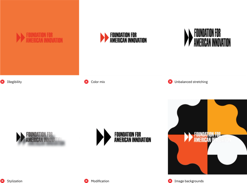
When using any variation of the logo, avoid the following:
- Color combinations that make the logomark illegible
- Different colors for the logotype and symbol
- Stretching, warping, or altering proportions
- Stylistic effects such as outlines, drop shadows, or bevels
- Scaling, repositioning, or otherwise modifying the logo
- Placing the logo over images that reduce legibility
Colors
FAI's primary palette is International Orange, Cod Gray, and Pure White, supported by a range of secondary and tertiary accent colors. The brand adapts visually to its content while maintaining consistency through these core colors.
International Orange #FF4F00

Cod Gray #121212

Pure White #FFFFFF

Chrome Yellow #FFA300

Celestial Blue #4997D0

Timberwolf #D9D9D6

Please contact Creative Director Chris McCaffery at chris@thefai.org with any questions regarding use of FAI's logo or brand identity.